MAKAN

LOGO WALL


WEB/APP
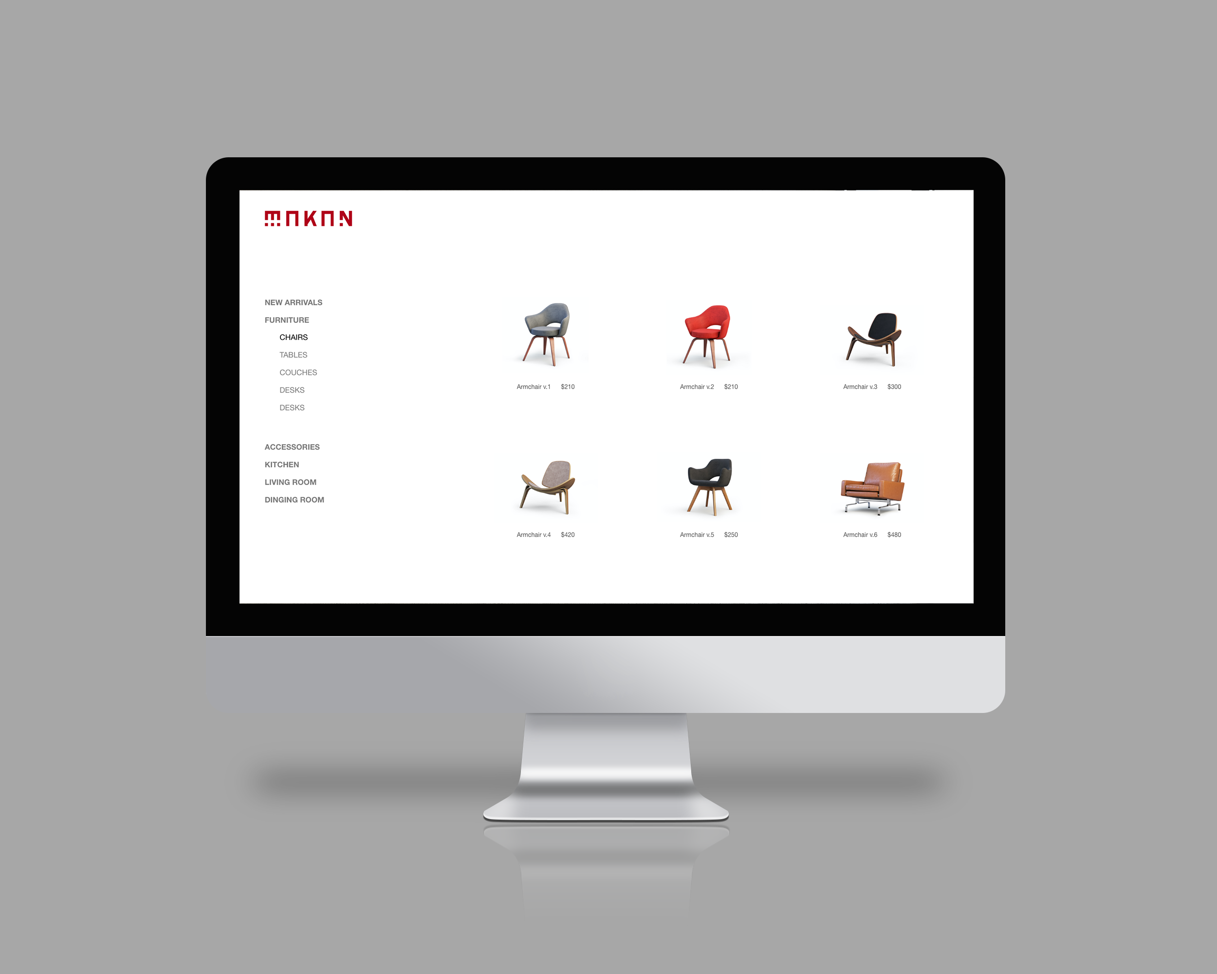


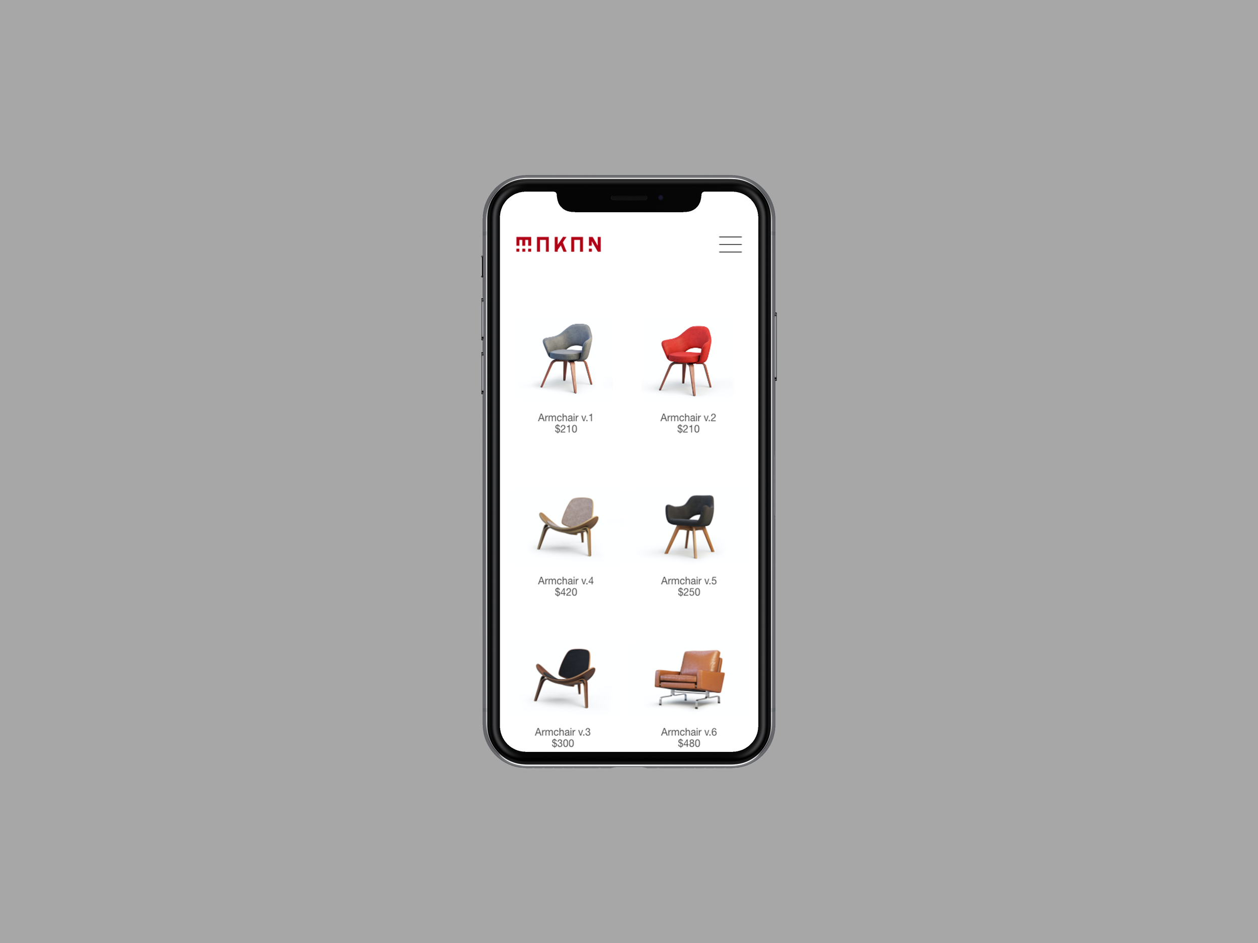
PRODUCTS






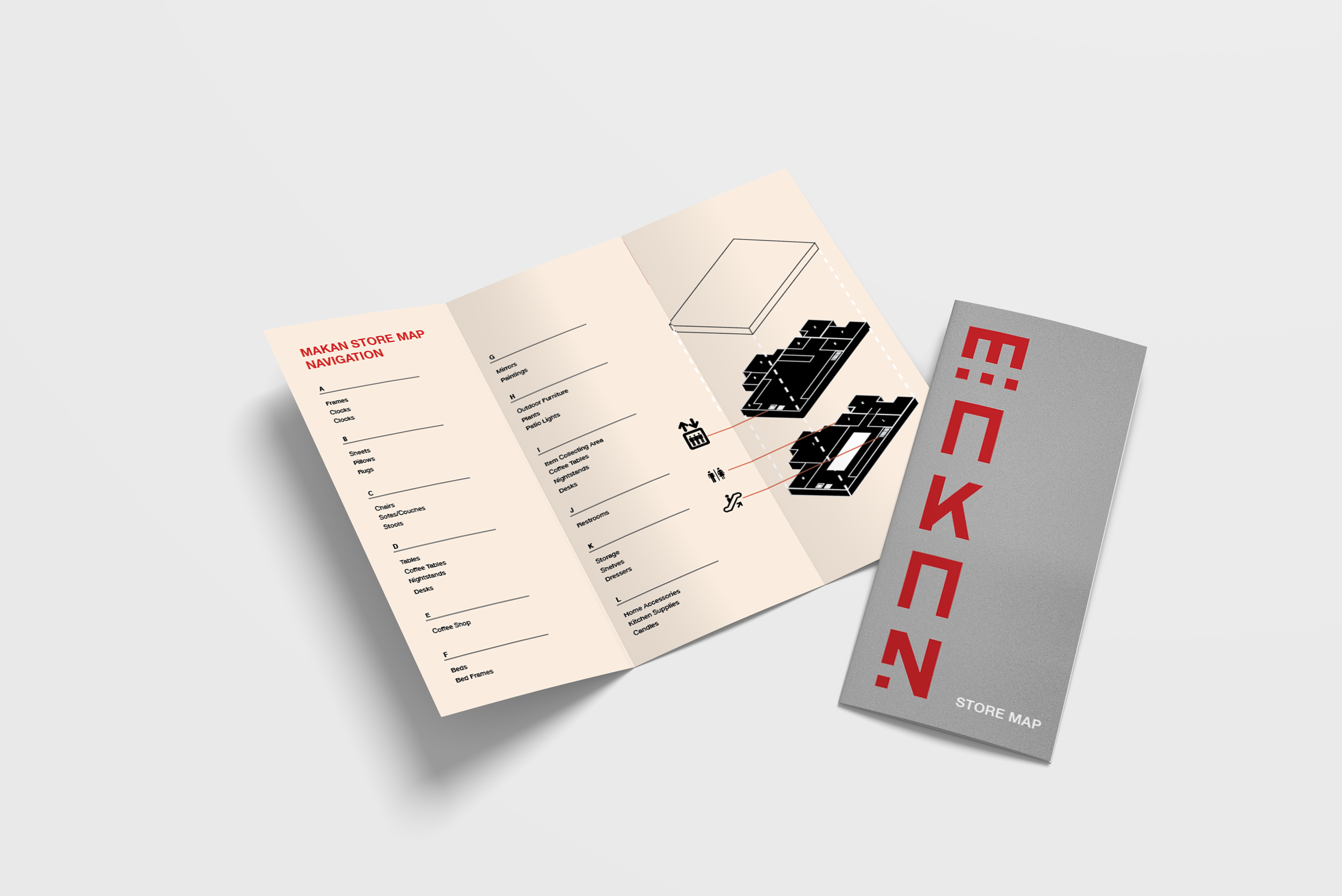
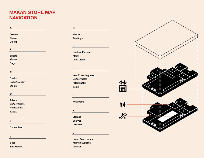
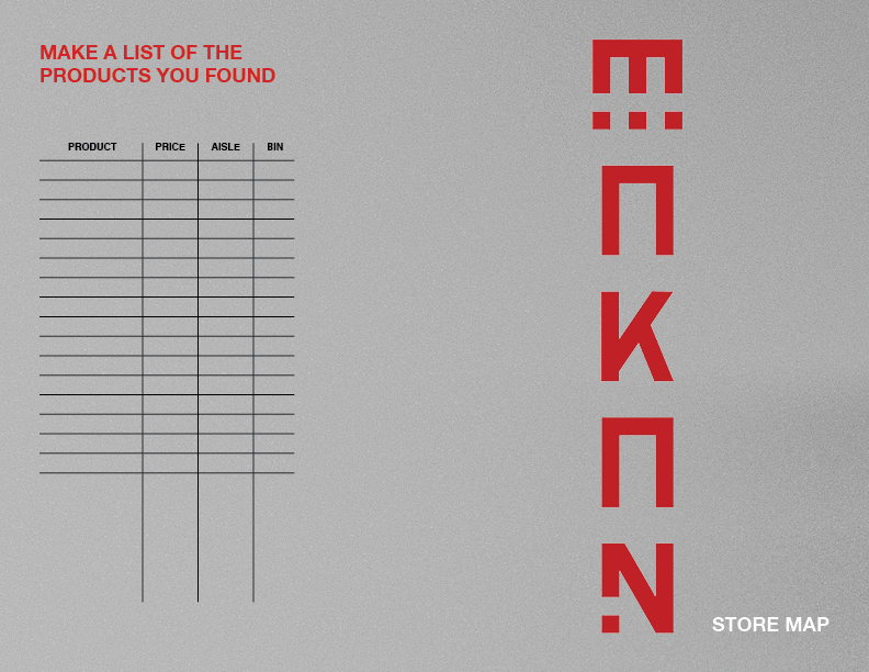
STORE MAP
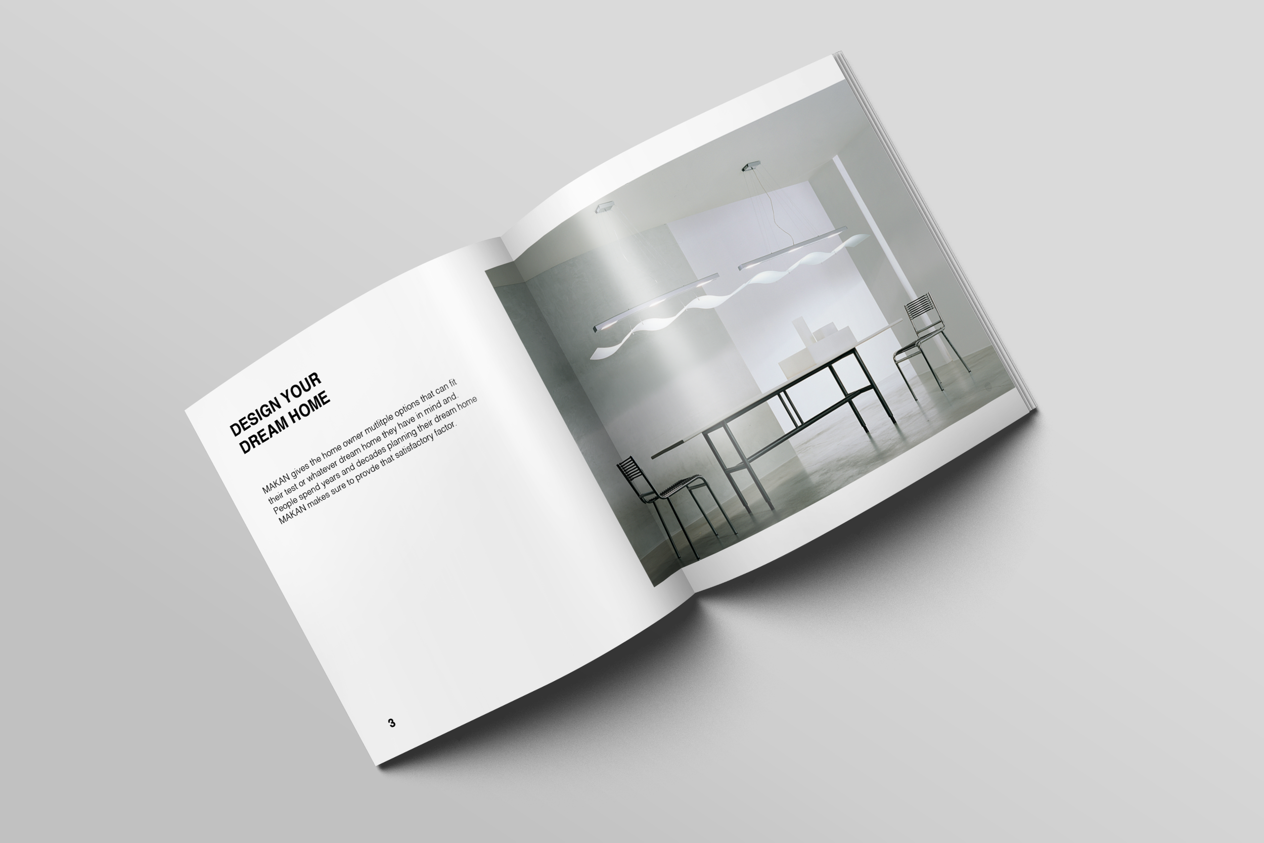
STORE MAGAZINE

STORE


MAKAN AD
LOGO
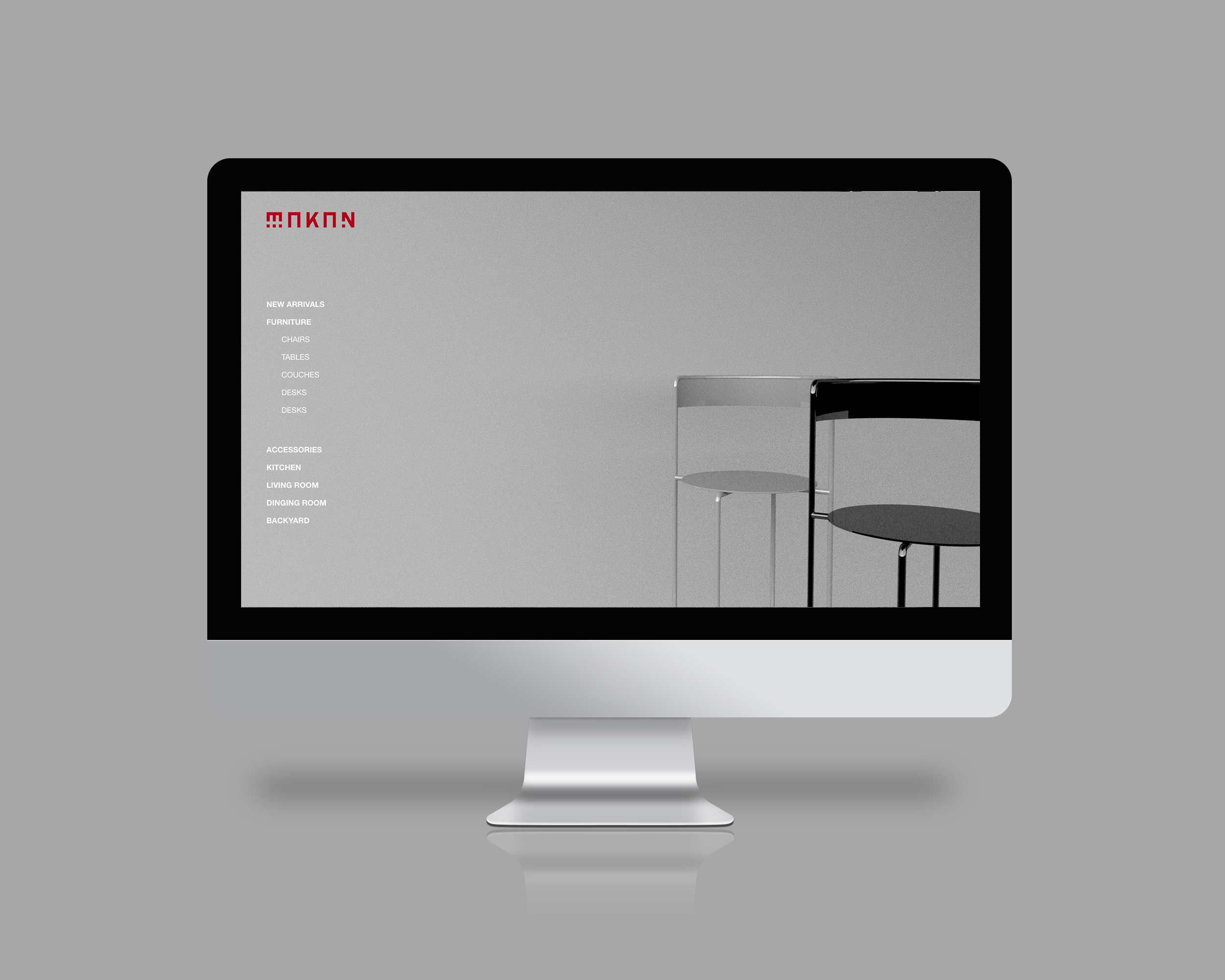
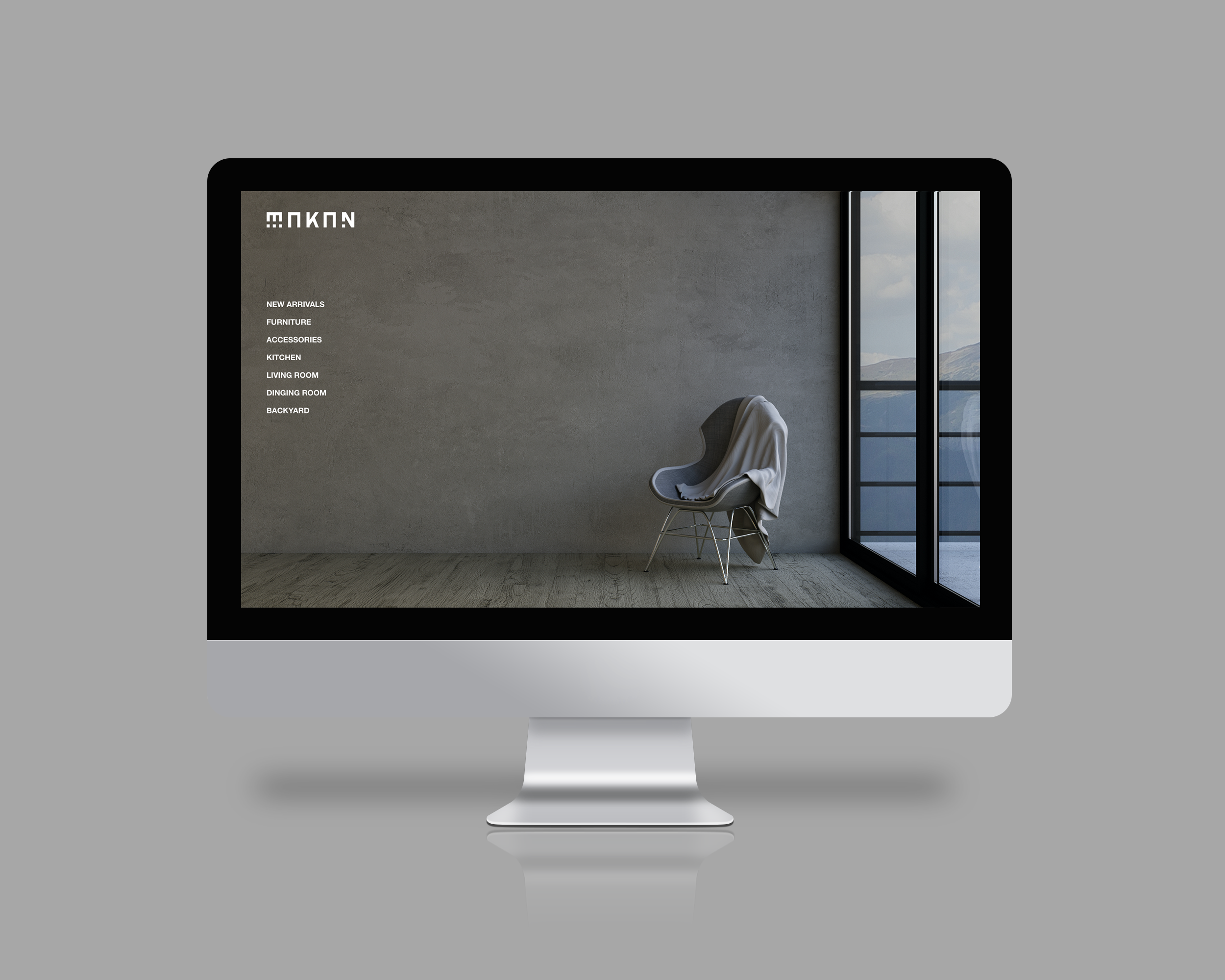
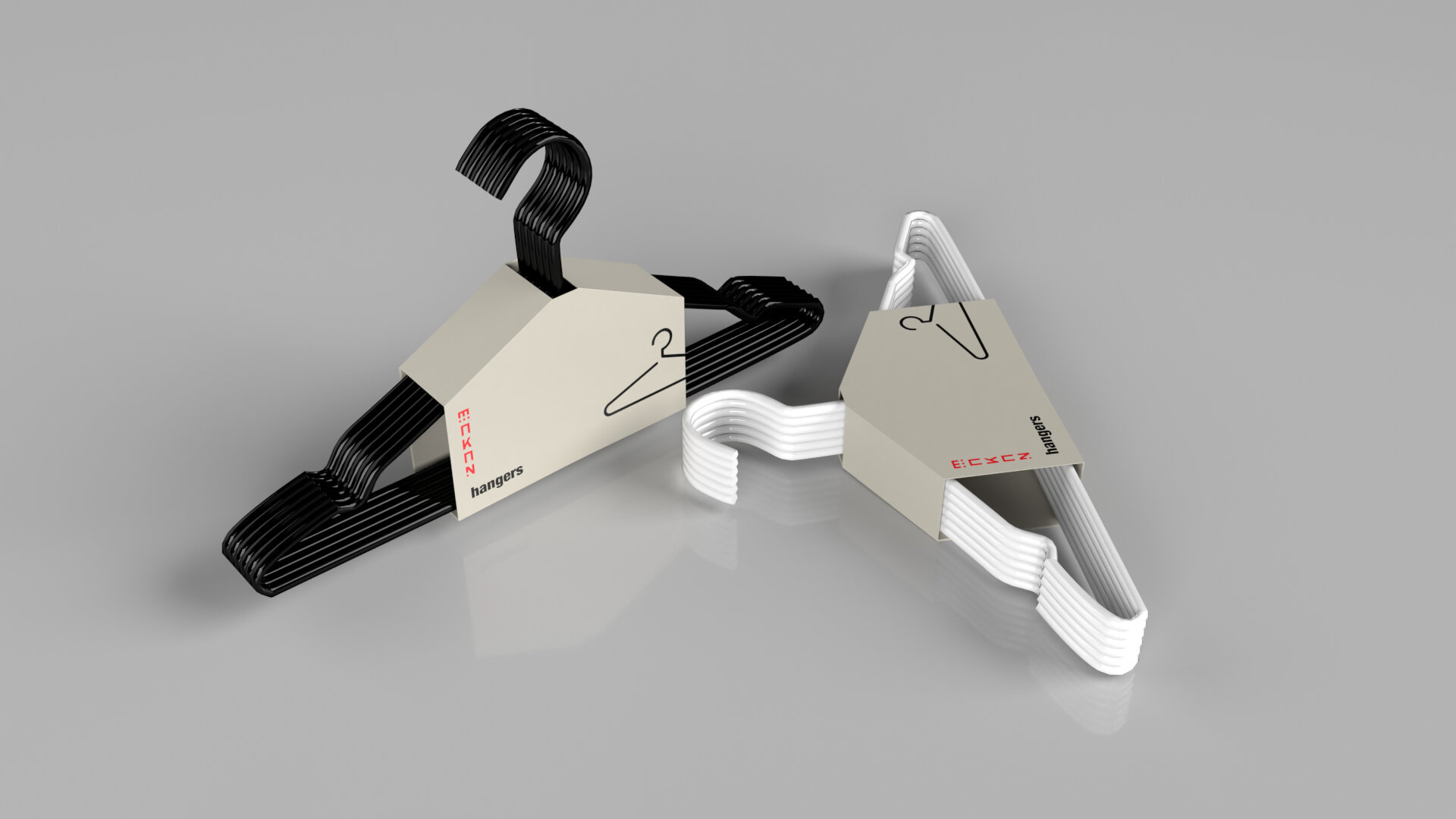
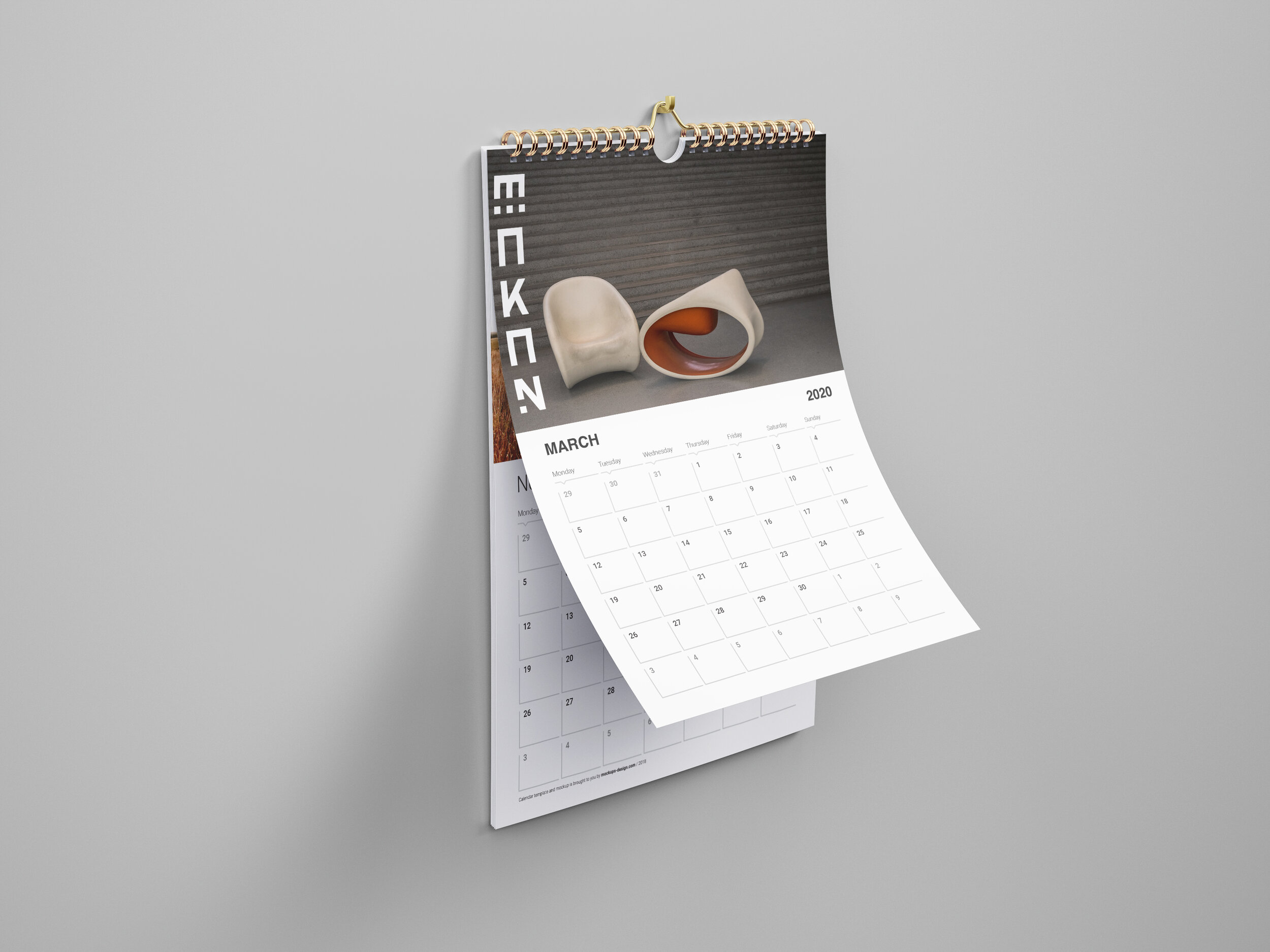
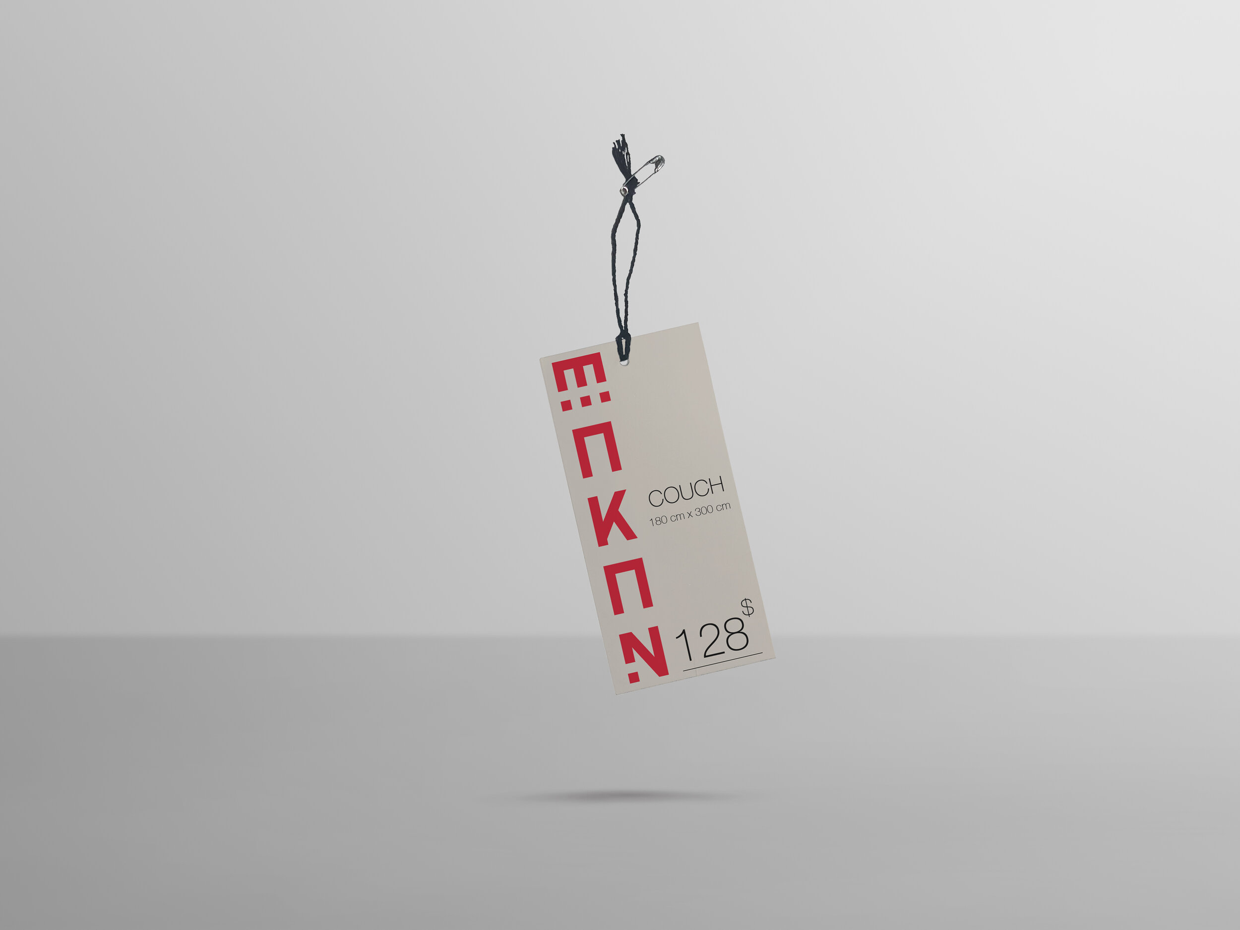
MAKAN is a home furnishing company that also provides home accessories that are affordable yet minimal. It is also a place where family and friends can come together to help create their dream home. MAKAN also hold an Arabic tone to it playing with some aspects of Arabic calligraphy and typography that holds a design element to it, making us stand out from the rest.
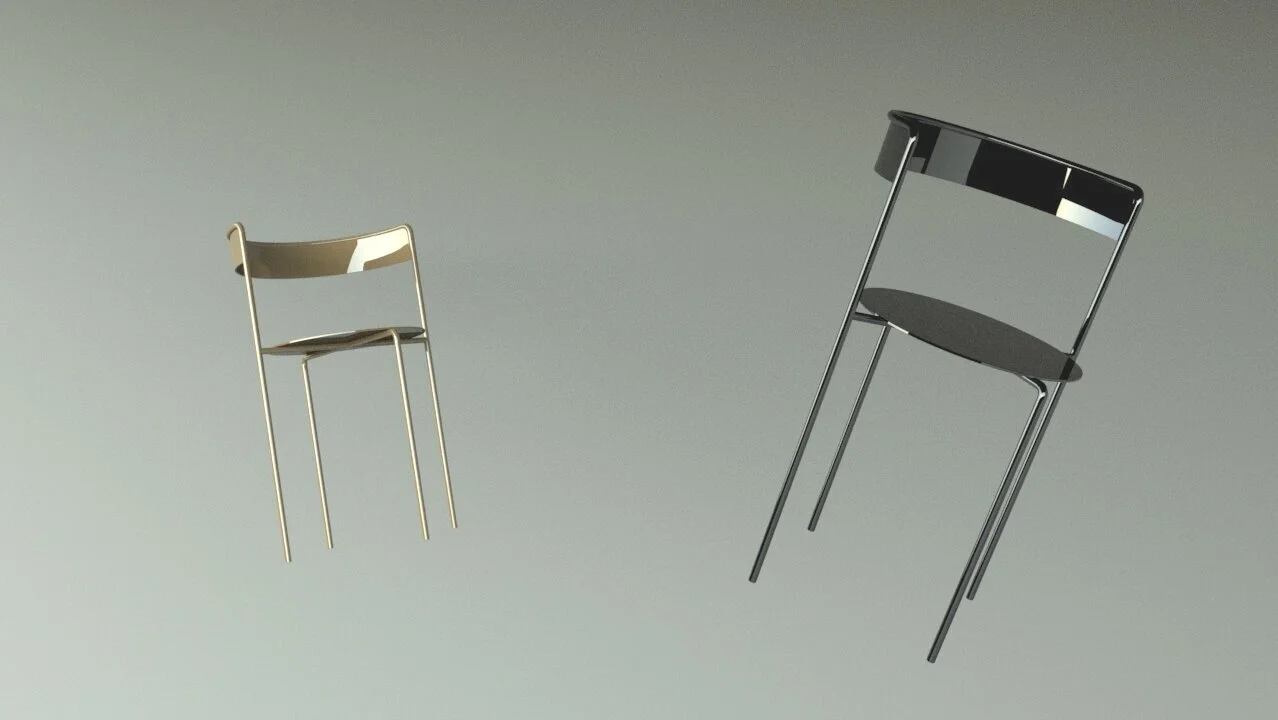
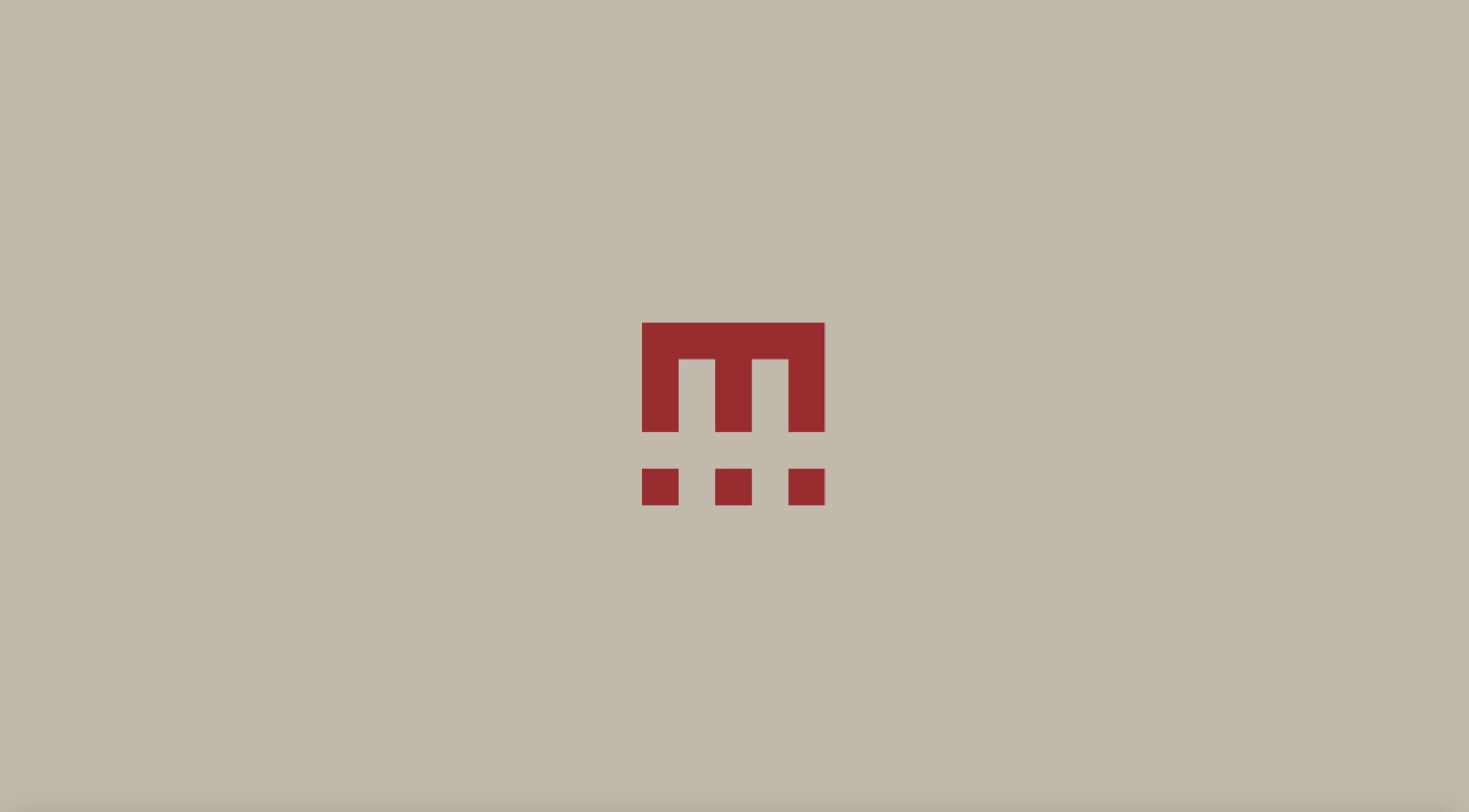
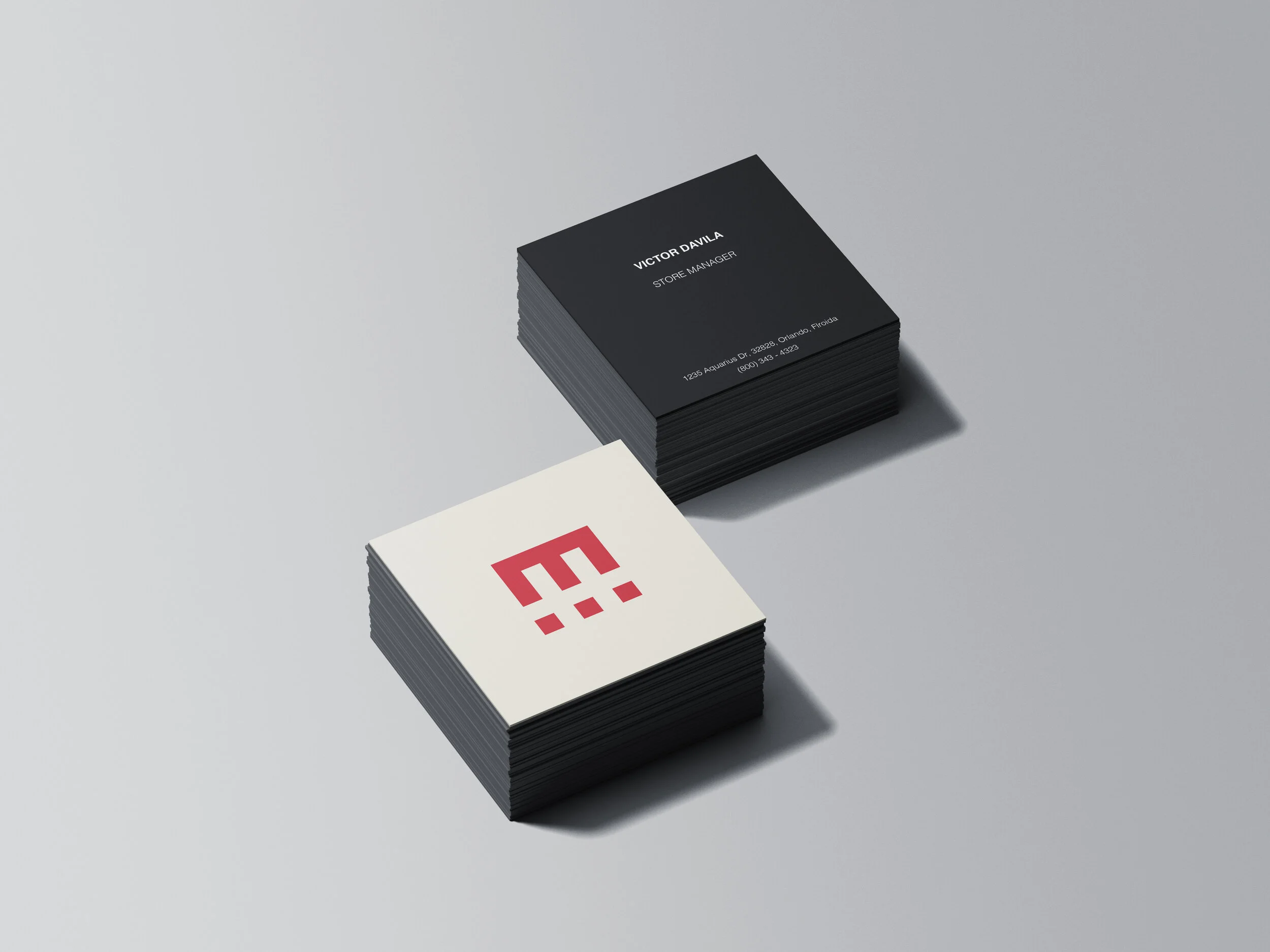
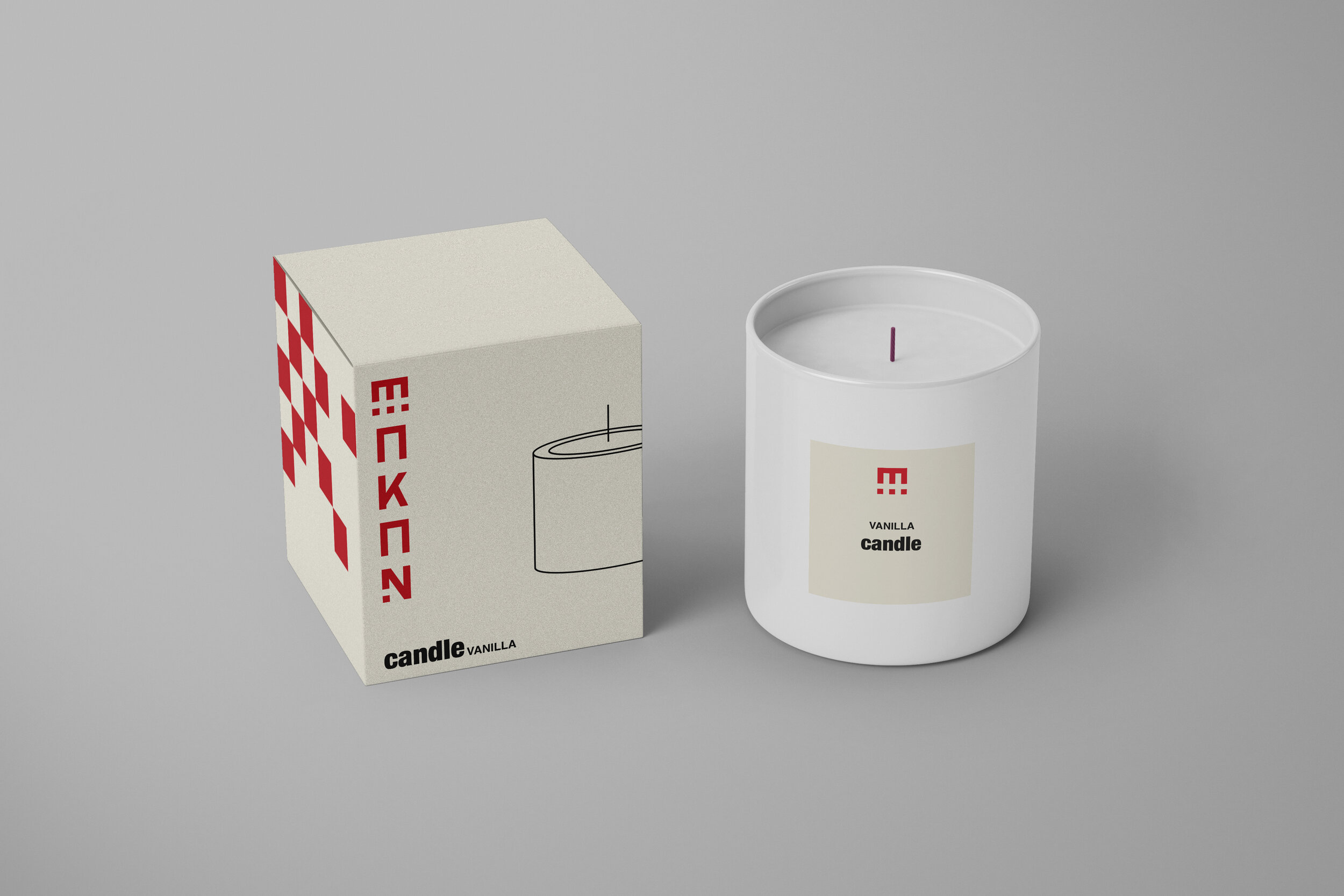
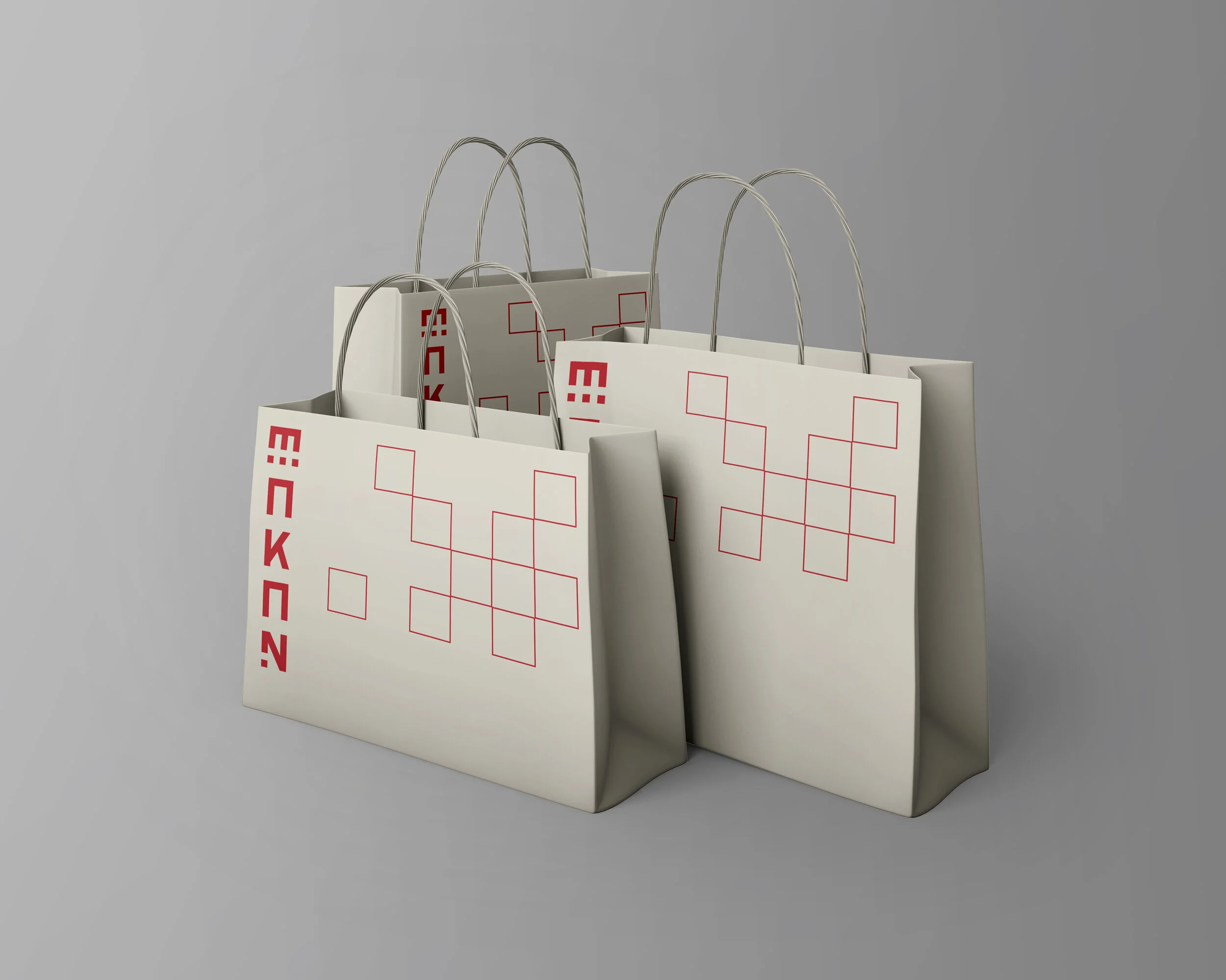
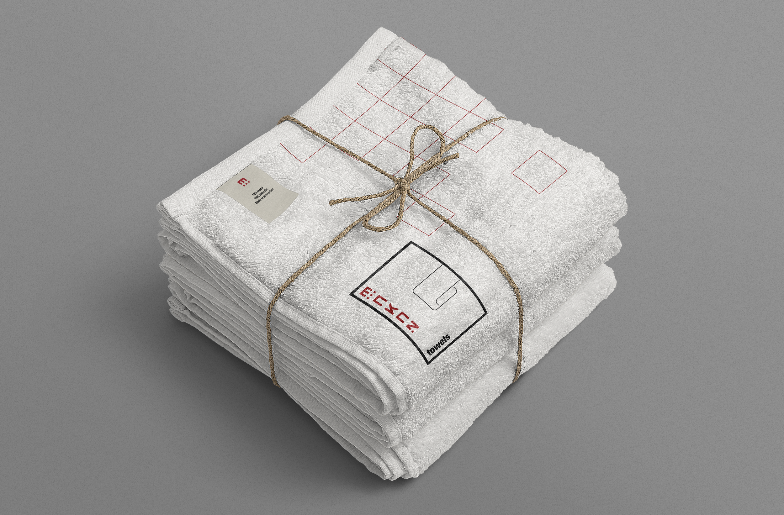
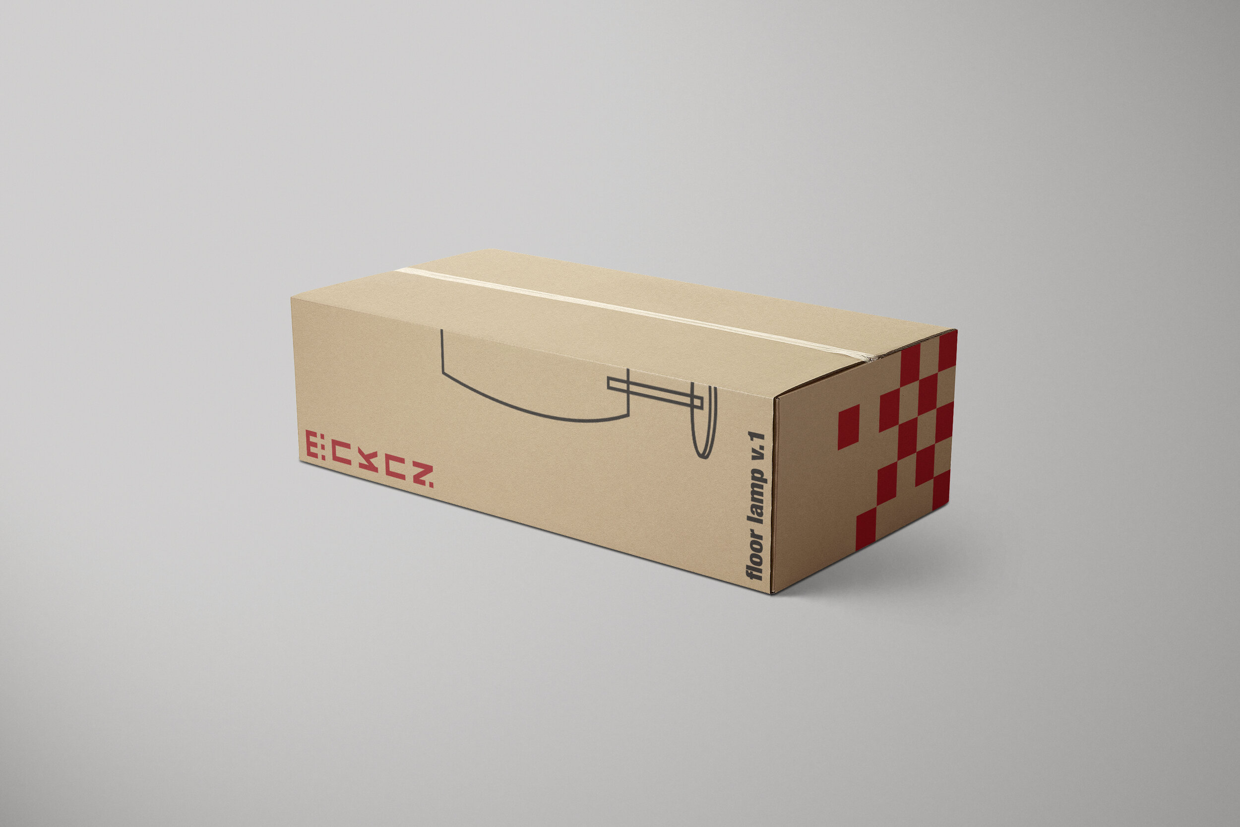
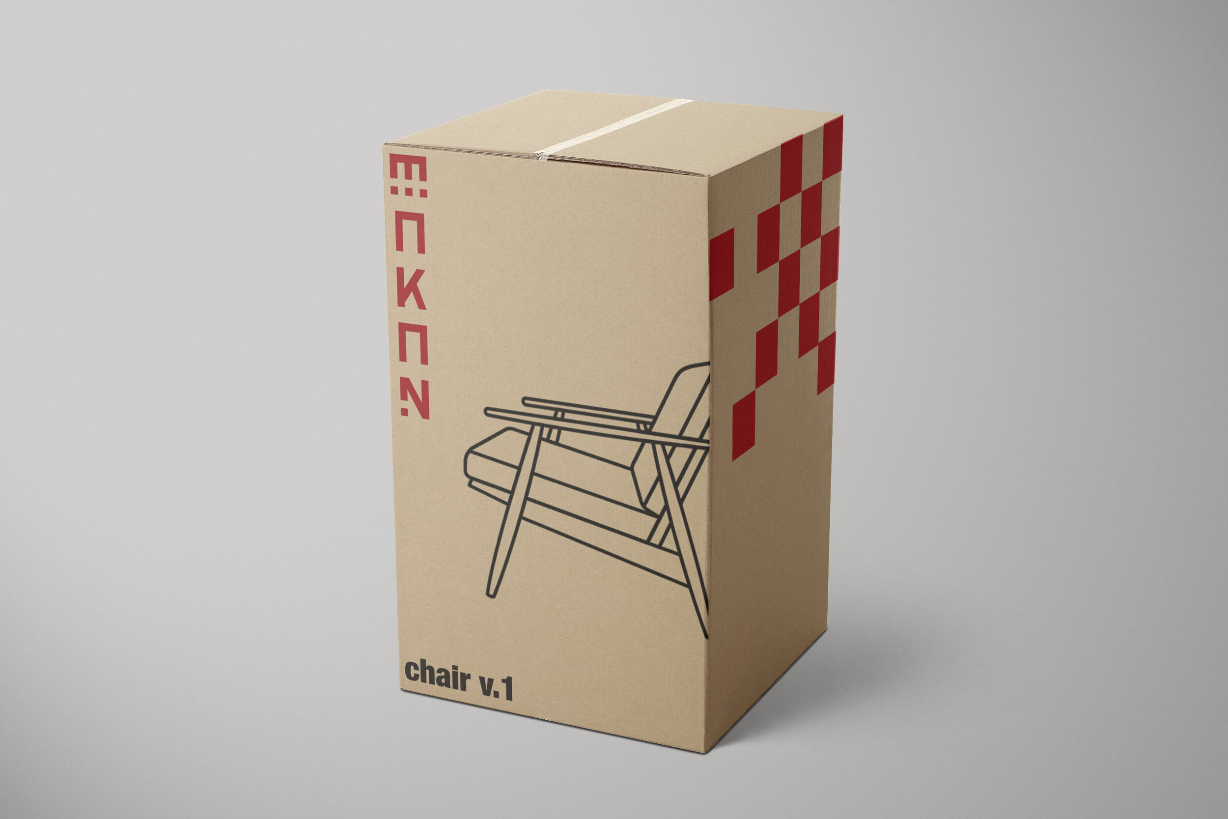
My purpose when it came to creating the brand MAKAN was to bring a visual of what a modern, minimalist approach of a furniture store would be. Inspired by early Bauhaus work of furniture design. Not only that, the color choices I have made are heavily inspired by Bauhaus as well. Taking inspiration from artists such as Moholy-Nagy, Josef Albers and Anni Albers. From these artists, I was inspired to create the geometric patterns I have placed throughout my packages. Mostly geometric patterns, repetition and line works. As for the logo design, my main thought was approaching it as if it was an architectural design, which was also inspired by other Bauhaus architectural designers such as Marcel Breuer. The logo is made mathematically and with accurate measurements with a set of cubes, imitating pillars of an actual house or a base for it. The word itself “MAKAN” is an Arabic word that means place. The reason behind this was the implementations of accents on the word MAKAN in English, imitating the accents present in the Arabic letters. Another reason why I chose an Arabic word was to add a little of my culture to the company, which makes it more personable. I wanted to design MAKAN as a place I would love to visit myself, almost like a museum furniture store where the furniture pieces are the art works themselves.


